Challenge 3 of 52: Samsung Charger


I think we all can relate to this problem. So many chargers to bring and each one is such a mess. Sprawling and tangled cable is the norm.

In thinking up a solution for this one, first I observe what the current design already allow the users to do. It turns out you can perfectly wind the cable around the charger body. However, there's no way to secure the tightly wound cable from unraveling. It can sit still on the table but most users would like to bring it in a bag and not making such a mess later.


Since this is a failure of the last mile, my proposed solution is just a small tweak. A small clip will allow the charger head to secure itself to the wound up cable and prevent the whole thing from unraveling. Then users can happily toss it in the bag and carry on.


Challenge 2 of 52: U Mobile Prepaid Android App


This time I'll look to re-design a part of service that I personally use which is U Mobile Prepaid. I use it  on my secondary phone and heavily use it for mobile data. The scope of this week challenge is the unofficial U Mobile Prepaid Android App.

First of all, it's such a big missed opportunity for the telco not to come up with an official app. It can be a good platform to increase usability and user's satisfaction. Somehow, an individual took initiative to do an unofficial app and release it on the Google Play Store.


Basically, this app is a 'skin' for U Mobile Prepaid USSD codes. Instead of remembering the weird codes and entering it on your own, you have the app to remember it for you. It is straight forward and all the main menu are prominently displayed. However, the ad cuts through two buttons - that's a silly mistake that should've been avoided.


When you request for any information, you'll see system message stating that USSD code is running and later on a USSD window appear with the information. This break the illusion that this is a 'proper' Android App.

So, how a re-designed should look and function?


So here's my quick sketch done under 15 minutes. The new app focus on the key information that the user wanted to know which is the credit balance and the last call cost. Main difference is that the app is more pro-active, instead of waiting for user to request the information it will do the query each time after the user made a call. 

The rest of the function is hidden in another page indicated by the orange notch in the lower right corner. If this is made by U Mobile, it can increase the overall user experience and also a better platform to promote new products and services to users. Users will also perceive higher transparency from the telco and have 'proof' that they are in fact receiving free calls. This will later on lead to word of mouth promotion among the users.

Challenge 1 of 52: Emergency Instruction


To kick this year long challenge, I pick this humble emergency fire extinguisher notice. I found this in the LRT when I'm meeting up the Tandemic team to go to Penang. I always thought of doing something with the LRT for the first challenge so this is will be a good start.

This particular notice draws me for several reason. First, is the extreme condition when you actually need to depend on this particular instruction. If you need to follow it then there's something burning in the LRT. Gasp, it might even be the LRT itself. Considering the fact that you are in a confined space make facing a fire in an LRT a nightmarish proposition indeed. So a clear instruction and a working fire extinguisher will be a welcome relief.


This bring us to the second point which if you see closely, there's a non-instruction among the three steps. No. 2: Alarm will SOUND. What does that supposed to mean? It's interesting to note that the Malay version doesn't capitalize 'berbunyi'. Sound is not an action for you to take. You are only supposed to pull the handle and remove the extinguisher.


But then, not telling ahead the alarm will sound will make the user panic. He will think, what else have gone wrong? But at the same time the non-instruction muddles the instruction.

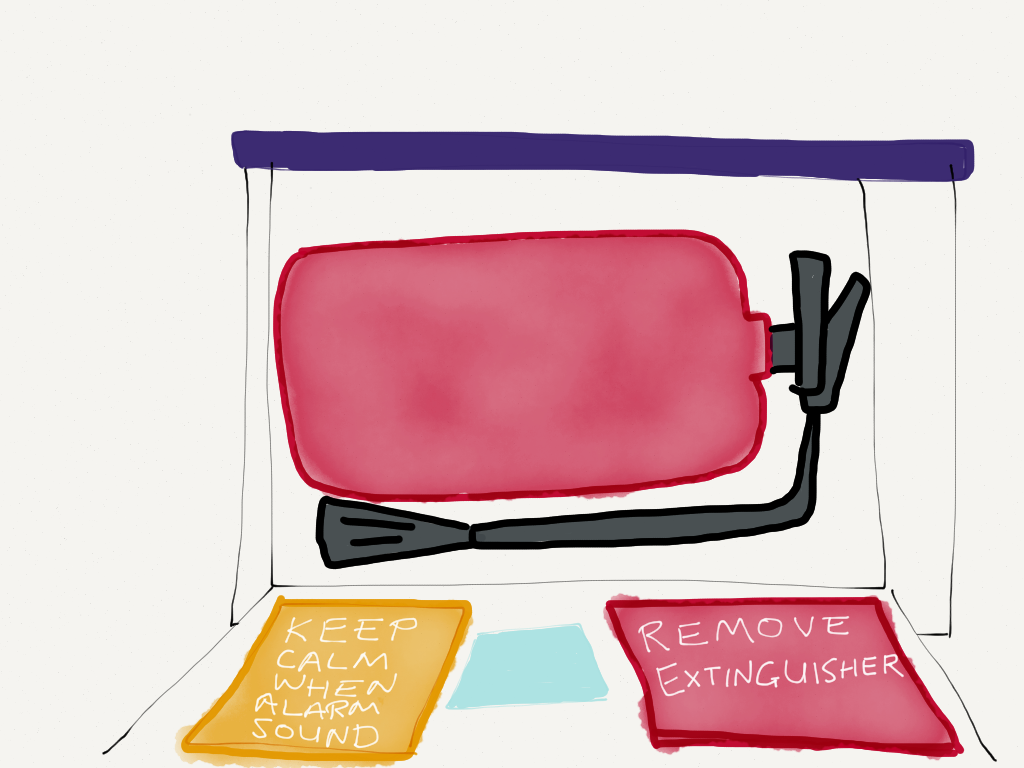
For the sake of simplicity, I'll present the proposed solution just for the English version of the instruction:


The whole idea is to make the instruction clearer and not overwhelm the user in emergency. So at the outside panel it simply states there's an emergency fire extinguisher inside and instruct the user to pull to open. The handle is highlighted red to emphasize the instruction.


Once opened, there is the next instruction to remove the extinguisher. Notification about the alarm is put in a distinctively different panel to differentiate them. This tells that it is not an instruction - just informing that the alarm will go off.

Well, that's it for my first challenge. Looking forward for a new one next week. Do leave your feedback after reading!

52 Weeks UX Challenge


Inspired by 52 Weeks of UX and 50 Days 50 Problems, I decided to embark on a challenge of my own. The premise is simple, each week I'll observe anything that users interact with be it product, building, website, service, signboards, etc. Then I'll propose a better design to make users life easier.

This challenge itself is a design-thinking solution for not having a UX Masters Programme in Malaysia. So I'll draw up a curriculum of my own and give assignments to myself. Obviously, there's no official certificate in the end but I believe learning by doing will help develop myself better as a UX Practitioner compared to enrolling in a non-UX Masters programme.

That's all for the intro, I'll present my first assignment later this week!

Sketchnote: Android Design


Alright guys, this time I bring you Sketchnote on Android Design based on talk by Taylor Ling. There's another part of his presentation that I'm yet to sketch so stay tuned for it next week.

Pre-Launch of UrusKelas.com


Alhamdulillah, yesterday mark the pre-launch of UrusKelas.com - a learning centre management system. It seeks to simplify student management and fee collection. For the time being we only offer record keeping and management.

Planned features include:
  1. Multi-branch management
  2. Email reminder for fess
  3. SMS integration
As we are still in Beta, we open the door for free account registration. Early users will get exclusive offer and early acess to new features.

Check it out at UrusKelas.com

Note: Kok Chiann's talk at UX Malaysia is a timely input for this project. Enjoy the sketchnote I made here.
© My UX Info 2012 | Blogger Template by Enny Law - Ngetik Dot Com - Nulis