Somehow, jaundice is a surety for newborn these days. As parents, suddenly you are facing new numbers and measurements associated with it. Concerned grandparents, family and friends will ask about the jaundice level which is actually the bilirubin level.
Yes, the medical lab result spell out the bilirubin level and the ideal range but it can be hard to fathom. The ideal range change according to the age of the baby and it can be hard for parents to understand the severity of the condition. One need to really squint and read between the lines to put the data given in perspective.
The medical lab result could use some graphical upgrade to give better perspective and understanding to the parents. It can display the result in bar graph that show the current reading in relation with the ideal range. Thus, parents can see whether they are near the ideal range or not.
As there's multiple test done in an admission, the result should also combine the readings. This will better show the progress of the condition and give an indication when the baby can be discharged.
Challenge 17 of 52: Safety Baby Bath Tub
When you become a father, suddenly there's so many things to keep an eye on. Things that we took for granted can be downright dangerous (and fatal) to newborns. This is true even for routine task such as bathing the baby.
The recommended practice is to fill the bath tub with cool water first before finally adding the hot water. Only then we start to bathe the baby. But then, general inexperience plus sleep deprivation can make you forgot the standard practice.

Looking at the IKEA bath tub we had, the green lines grabbed my attention. It already play a role in safety by preventing the bath tub from slipping. It'll be better if it can indicate the water temperature - green for ideal temperature, blue for too cold and red for too hot. I'm sure it'll be a hot product among new parents!

The recommended practice is to fill the bath tub with cool water first before finally adding the hot water. Only then we start to bathe the baby. But then, general inexperience plus sleep deprivation can make you forgot the standard practice.
Looking at the IKEA bath tub we had, the green lines grabbed my attention. It already play a role in safety by preventing the bath tub from slipping. It'll be better if it can indicate the water temperature - green for ideal temperature, blue for too cold and red for too hot. I'm sure it'll be a hot product among new parents!
Challenge 16 0f 52: TV Input UI
Taking early paternal leave made me sort of a TV junkie. As I also cleared my schedule from meetings and projects, suddenly I find myself spending much more time in front of TV. Naturally, I spotted a few things to improve about the device UI.
With so many set-top boxes connected to the TV, figuring out the connection can be a daunting task. Physically, there's so many ports and there's no clear label. Many are only labelled with embossed plastic text which is hard to read since it's the same color as the device. The solution should be bright color-coded label to mark all the various ports
Once connected to the TV, the UI is not helpful either. The on-screen label simply says HDMI 1, HDMI 2, and so on. It's certainly not very helpful for most user. The UI should be more proactive by asking the user what is the connected to each port when a new connection is made. Certainly it's not that hard to provide soft label for DVD, Blu-Ray, Cable, Laptop, Game and so on.
Even better, the TV can have a connection map screen in the menu. It will display all the devices that is currently connected to the TV according to the physical location of the ports.
Challege 15 of 52: Electrical Appliance Remote Control
For an interface that we use every day, electrical appliance remote control is an annoying lot. There's too many button, uncomfortable shape and ambigous label. But then, the most annoying part is the connection between the remote and the appliance itself.
Infrared remote control is a technology is a technology that is older than myself - antic in term of gadget age. The biggest drawback of this connection is that it requires clear line of sight. These days, with cramped living room and odd corners it's quite a hard reach.
There's not much problem for TV, but set top boxes are routinely obscured by other furnitures or other trinkets that line the cupboard. It's even worse for air-conditioner unit which usually end up in a corner that don't have clear line of sight from the bed or couch.
So, what's the solution? Bluetooth seems like a good candidate. Phones have generally replaced IR with Bluetooth for the past few years. It's a shame that remote controls didn't follow suit. However, pairing procedure can be rather frustrating and the phelotra of bluetooth services in the protocol make it harder still.
Combining Bluetooth with NFC can be a star combination. Just tap the remote with the device and it will seamlessly pair the two. It will be handy when you need to borrow the remote and use it with another device. After all, remote controls do have a bad habit of hiding themselves.
Challenge 14 of 52: Laptop Sleeve

Laptops rarely works alone, at least it must have power adaptor to achieve a meaningful working time. External hard disks, mobile hotspots are also the usual suspects. However, laptop sleeves usually didn't have any decent place for them. Some user just jam those stuffs into the sleeve anyway and create an unisghtly bulge. Not to mention the risk of scratching the precious stuffs inside.


Challenge 13 of 52: Chatime Menu

Sometimes, UX problem crops up due to the pace of innovation. This grotesque menu is the victim of Chatime's success in creating so many variation of beverages. The dense menu is frankly intimidating to new customers and made old customers stick to whatever drink they tasted before. That's a waste since it will discourage new customers and make it difficult to increase revenue per customer.
Personally, I hesitated several time before buying anything from Chatime until I'm guided by a friend who patronized Chatime in Australia before. Even that he sticks from whatever he bought before and I only picked among the featured drinks. I consider myself fairly adventurous when it come to food and drinks so Chatime barrier seems disporpotionately high.
There's some visual hierarchy in this menu. The top bar features flagship drinks and this is a saving feature. Customers usually just order from the featured line. But then, more adventurous customers and those who don't like any of the feature drinks will have a hard time navigating the ala-carte menu.
A clear visual hierachy is missing here, choice of drinks and their personalization options sits on the same level and only separated by different color blocks. This is a stark contrast to Subway's logical layout that guides customers step-by-step; from bread, filling, cheese, condiments, sauces and sides.

Thus, a better menu design should guide the customers step-by-step. From the base drink, to sugar and ice options. Finally, the upsell to toppings. This should make it easier for new and old customers alike.
Challenge 12 of 52: Cheese Powder Packaging
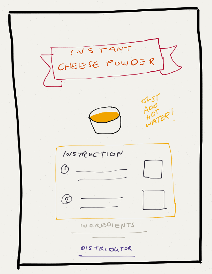
Few weeks back, Mr. Haris Faizal come to me for some business advice. He's also one of RoketSMS early customers. His product is an instant Cheese Powder and below is his current packaging.

So, what are we going to do with this packaging? Mr. Haris aims to double his sale and design is one of the area to be tackled. He reported that a number of grocery shops rejected his product because of the lackluster design.
Changing the packaging from simple plastic pack to box is too expensive for him so we need to work around the sticker. The current design is too cluttered so the first thing to do is to bring some visual hierarchy to the design. Lower part of the current design looks like a mass of nonsensical text due to the use of same font size for all type of information. The instruction, ingredients, distributor information and expiry date is all jumbled up together.
The obvious thing to do is to make the Ingredients section smaller because it is there just for compliance sake. Focus should be given to the instruction because there lies the value proposition of the product. Consumers are buying convenience here so the packaging need to sell how easy it is to prepare the cheese dip.
This is further reinforced from customer frequent question which is do they need to cook it on the stove? Actually, they just need add hot water. Thus, the instruction should be made crystal clear and hightlight 'Just Add Hot Water'. Also, change the name of the product to Instant Cheese Powder for good measure.
Challenge 11 of 52: Error Handling in RoketSMS
As a designer, we usually fall trap into two kind of oversight. First, what we thought was important is not important to the users. Secondly, things that we thought will not go wrong will go wrong in the hands of the user.
I think I've sorted out the first oversight last week so this week I'll drill down the second oversight. As the designer of the web app it seems really obvious that the message limit is 160 characters and you need a valid phone number to send the message to. So, during my tests I skip over these two scenario.
Then come real users and the errors crops up. The problem is that error message given by the system is unhelpful. The error is the same no matter what causes them - either a crashed database or simply an invalid phone number. This causes distress to customers especially since they stand to lose precious SMS credits.

The top two error is that the message is too long and invalid number. There's two ways to manage errors; first is to prevent the error from happening and secondly give more helpful information. One is proactive while the later is more reactive.

Preventing the first error is straight forward. Just put a character counter and disable the send button once the limit is crossed. For the time being I ask users to check character count at http://www.charactercountonline.com/

For the second error, a delivery report function should be implemented. This will help users to identify the faulty record and delete it.
Another week, another challenge completed. I think I'm going to look into food & beverages in the coming weeks.
Challenge 10 of 52: New Features for RoketSMS
Double digit! At last! Alhamdulillah, still managed to maintain the momentum. Now, I'm almost 20% through the project.
RoketSMS have started to have paying customers. Most are strangers that come from FB Ads. Only one is a friend that pay in person. After they had been using it for a few weeks, I emailed them to vote for new features to be included in the next version.
Many replied the survey promptly and here's the result for the top two feature request:
- Contact groups
- SMS customization
So, I get to work and design the UX for version 2. For the contact groups I decided to implement via tabs since that's a familiar approach for anyone that use modern browsers. Certainly it will suitable in a web app.
As for SMS customization, I decided to reduce the probability of error. Rather than introducing markup codes to be inserted manually by the users, it will be easier to choose from a drop down menu. This will reduce error probability and saves us from adding a preview function for the time being.

Looks like my hypothesis about user requirement is off the mark. Rather than TinyLetter for SMS, it seems they wanted GetResponse for SMS. All and all, it's good to have paying customers and helpful feedbacks,
Next up: Error Handling design
Challenge 9 of 52: Pedestrian Bridge
Every week, the source of inspiration for the assignment keep changing. I rarely read physical newspapers these days but since my father-in-law regularly buys them so I still stumble upon it. An article few weeks back clearly grabbed my attention.

The headline screams "Need for pedestrian 'map'" and "Pedestrians fear for safety on deserted bridges". Furthermore, the image featured shows a familiar sight - the pedestrian bridge that connects from Ampang Park LRT to The Intermark. I saw it every time I exit the LRT to get to the virtual office space at Troika.

So, let's address the complaints highlighted in headlines. First, "Need for pedestrian 'map'". I don't know why the journalist put air quotes for pedestrian map. It is a legitimate map, even though it is for pedestrian use and not for drivers
I decided to check out the newly opened Jaya Grocer at The Intermark and buy a head of Iceberg Lettuce. My starting point is the Ampang Park LRT and end at level 2 of The Intermark. There's a sign pointing to Doubletree by Hilton at the start of the route. Seems good, but unfortunately that's the lone sign I encounter along the way.


Since I've been to The Intermark, it's not a problem for me to get to the supermarket. After buying the lettuce, I immediately head back to The Troika. There's no signboard on the way back either. In fact, I saw a tourist asking the security guard for direction.
The solution? Well, just draw up a map and print it out! Show the route and the landmarks. Here's my sketch below.


With the first complaint busted, let's move on to the next one - "Pedestrians fear for safety on deserted bridges". How deserted is the pedestrian bridge? When I went to the supermarket, there's hardly any people and I can count them with my fingers. However, on the way back it's a different scenario as it's already lunch time. Throngs of workers ply the bridge in both direction to go to eat. There's definitely good food on both side of the bridge.


| Deserted bridge |
 |
| During lunch hour |
So, the real complaint is that the pedestrian bridge is deserted outside peak hours (eg; start and end of office hours, plus lunch hours). As I stated earlier, there's already a security guard stationed half way along the route. That helps a bit, but not by much.
 |
| A tourist asking the guard for direction |
What really qualifies as deserted? In the documentary Urbanized, a space of 100m by 100m is the maximum dimension that is comfortable for human cognition. Bigger than that, it is perceived as too wide open and invites a feeling of vulnerability.
The route is L-shaped and each side is roughly 50m long. Thus, it is only 50m by 50m - half (or is quarter?) of the said maximum area. Perhaps, this perception is relative. Compared to other spaces around the bridge it is by far the widest expanse of area.
The solution? One option is to divide the lane with signboards - it can display maps or advertisements. At least it will cut the perception of vastness on one side of pedestrian field of vision and bring it to a more manageable level. A more expensive option is to enclose the bridge with tinted glass similar to the one that link KLCC to Pavilion. It's a longer route but didn't feel quite as vulnerable as the Ampang Park - The Intermark route.
I'm looking forward to next week as it will be the 10th challenge. Personally, seeing the number cross over to double digit is a great breakthough. It also meant that I'm almost 20% through.
If you have any product, service or outlet that need some UX insight, I'm glad to offer a free one hour consulting and feature the proposed solution in this blog. Just email me at firdaus.ariff@gmail.com for further info.
Challenge 8 of 52: Laptop Repair Service
 |
| [L-R] Mr. Edzwan, Mr. Syahrudin & Mr. Ifwat during our Business Model Canvas coaching session |
Typically, most customers come personally to the shop with their broken laptop. This limited the scope of potential customer to Ipoh City and surrounding area. Few are willing to courier their broken laptop and those who are willing didn't know the best way of securing their laptop for shipping.

Currently, they suggest the customer to find bubble wrap or egg cartons to pad their laptop. However, not all customers have the time to find the packing materials. Furthermore, how to establish stronger credibility to earn enough trust for potential customers to send in their broken laptop? If they are able to do that, it will expand their scope of potential customers nationwide.

Inspired by Zappos, I suggested that they provide packing kit to provide convenience their customer. Their customer can bank-in a minimal amount of money first and receive a package complete with bubble wraps and a sturdy box to secure their laptop. To step it up further, they can also provide pre-paid waybill to make it even easier to ship the laptop back to the repair center.
The goal of this User Experience re-design is to reduce friction and resistance for customer to move from Evaluation phase to Purchase phase. Less resistance means increased conversion rate for the business and increased revenue. This re-design also will convince that the Delivery phase will be a reassuring experience for the customer.
Need ideas to innovate in your business? Contact me at firdaus.ariff@gmail.com
Challenge 7 of 52: RoketSMS
This week entry is a bit different. Rather than describing design flaws around me and the proposed solution, this time I'll share about a project Abi Dzar and I work on. This week we released RoketSMS - a simple SMS marketing system. We rolled out to those who had pre-registered the week before.
What brings us to create this particular web app? Isn't there already a lot of SMS and marketing apps out there? Why SMS?
One strong drive that leads us to create this web app is the increasing frenzy of Internet companies to find and manipulate choke points. Facebook had flexed its muscle in monetizing the choke point. On average, only 10% of a FB Page fan will see any new updates. Need more reach? Pay Facebook.

Gmail also starts to follow suit by introducing the Promotions tab - a feature dreaded by email marketers. Open rates are down and adding salt to the injury is Google's audacity to sneak ads that looks like email right in the Promotions tab.

Apart from direct mail, SMS seems like the only convenient and affordable solution. Robo-calls are also available but I think that's too annoying to be an effective marketing medium.
So we set out to build a web app that help to collect mobile phone numbers and then send SMS broadcast to those who signed up. My experience with email marketing software such as Aweber and GetResponse reminds me to keep things simple. Businessmen and marketers wnated to connect directly with customers, not to be bogged down with bloated software.

Thus, our project is modeled after TinyLetter, effectively making the concept of RoketSMS as TinyLetter for SMS. This app is extremely simple, no autoresponder, no segmentation, no nothing - which is actually a good thing.


What brings us to create this particular web app? Isn't there already a lot of SMS and marketing apps out there? Why SMS?
One strong drive that leads us to create this web app is the increasing frenzy of Internet companies to find and manipulate choke points. Facebook had flexed its muscle in monetizing the choke point. On average, only 10% of a FB Page fan will see any new updates. Need more reach? Pay Facebook.

Gmail also starts to follow suit by introducing the Promotions tab - a feature dreaded by email marketers. Open rates are down and adding salt to the injury is Google's audacity to sneak ads that looks like email right in the Promotions tab.

Apart from direct mail, SMS seems like the only convenient and affordable solution. Robo-calls are also available but I think that's too annoying to be an effective marketing medium.
So we set out to build a web app that help to collect mobile phone numbers and then send SMS broadcast to those who signed up. My experience with email marketing software such as Aweber and GetResponse reminds me to keep things simple. Businessmen and marketers wnated to connect directly with customers, not to be bogged down with bloated software.
Thus, our project is modeled after TinyLetter, effectively making the concept of RoketSMS as TinyLetter for SMS. This app is extremely simple, no autoresponder, no segmentation, no nothing - which is actually a good thing.


With no outside funding, Abi Dzar coded the web app during his free time. Marketing started in earnest after the Eid holidays and after 10 days (or so) we are open for users.


That's our story so far, if you read Malay head to www.firdausariff.com for more in-depth story on this project.
See you guys next week.
Challenge 6 of 52: Toll Gate Jam

Living in Klang Valley, means that I regularly pass through tolls. I can face up to 5 toll gates crossing from my parents-in-law place to the city centre. Thus, I also see the same pattern again and again. All the cash lanes are clogged up, some people at the TnGo lane and a few passing through SmartTag lane.
At first, I thought this pattern is only applicable to interstate travels where people can't easily buy and reload TnGo cards. But then I see the same pattern in inner city toll gates. Most glaring example is Ampang Kuala Lumpur Elevated Highway. The toll fee is only RM1.50 but why on those commuters put up with the slow cash lane everyday?
True, the SmartTAG is expensive. At RM120, it's a luxury item for many low to medium low income earners. They are better off using that money to fill up their small cars full twice rather than splurging on a gadget that help them pass through the toll gates faster.
How about TnGo card? It's only RM10 and the minimum reload amount is RM10. Sadly, the economics of surviving with a meagre salary in a big city means that is also quite out of reach.
What's the solution then?
- Give the TnGo card for free with a purchase of RM10 reload
- Lower the minimum reload amount to RM5
- Make it easier to reclaim credit if the card is lost
- Add more outlet to buy and reload cards
- Discount for using TnGo
Moral of the story - if you have a TnGo card and a SmartTAG you are rich. What more if you have two active cards. At the very least you are richer than many people in Kuala Lumpur.
Challenge 5 of 52: Medication Compliance
For this Eid Mubarak edition of the challenge, I'll feature a UX Innovation by my cousin. This week had been chock full of travels and I barely have time to post this entry. Conveniently, one of my cousin is on duty this festive season and posted what she did on Facebook.


Let's jump straight to the problem. Patient medication non-compliance is a persistent issue in health. It presents in various forms such as irregular dosage, skipped dosage, or not taking the medicine at all. It is critical especially for medications to manage hypertension. I once followed my father to do medical outreach in the rural area and almost the whole day is spent on consulting patient one by one how to really take their medicine.
It's convenient to point the finger to patient's lack of discipline but medication instruction are also partly responsible for this inefficiency. The instruction are opaque and don't reflect the real requirement. For example, what most medication require is for patient to take it at a regular interval (8 or 12 hours) with a full or empty stomach.
However, most medicine come with instruction simply stating 2 times daily after meal. Usually, this will lead the patient to take it after lunch and dinner. However, the real requirement is to take it every 12 hours. So the real time should be 8am and 8pm - not 12 pm and 8pm!
My cousin took the initiative to graphically spell out the time it need to be taken. Patient can now clearly know the required interval. She even went further to individually pack each dosage. This way, the patient's caretaker can easily see whether he complied or not.
Challenge 4 of 52: LRT Ticketing Machine
Well, back to LRT again for the fourth design challenge. I didn't take the LRT everyday but I'll take one whenever possible especially when going to the city centre. On average I'll take one round trip per week.
Usually I'll use the TnGo and rarely have to contend with the ticketing machine. But then when you think about it for a moment, who's really using the machine anyway? Most likely it's not the daily commuters but tourists (international and local) and locals who usually get around by private vehicle. Simply put, the machine is to be used by those who are unfamiliar with both the machine in particular and the LRT service in general.
Let's check out the machine:

There's the touch screen, coin slot, card reader, and the rest. Not forgetting the LED scrolling display on top as well.

The focus today is on the screen and the map displayed. It is capable of interactivity but somehow underutilized. It even lacks audible and haptic feedback when tapping on the buttons.
The map is also unhelpful to unfamiliar users. It only display the station names and interchanges but no context whatsoever. People wanted to go to a specific place to shop, meet friends or do business not just going to a particular station.
For example somebody might want to go to KLCC Mosque. For those unfamiliar with the route might assume they need to get off at KLCC station. The truth is it is nearer to Ampang Park station compared to KLCC station.
So what's a better screen should look like? I propose that when the user click on a particular station, it will zoom in and show relevant landmarks around the station. That will give a better sense of direction and context to users.
Why just stop at landmarks? It is also possible to display ongoing events. Many people will take the LRT to go to exhibitions, conferences and concerts. In fact, they'll even come by the bus loads! The more they came, the more the confusion so every little bit of help matters.

On a side note, I've supervised a simple solution for a similar problem in Penang. Knowing that the Armenian Street heritage area lacks pedestrian map, my mentees came up with a prototype and install it on site. Here's a video of the little experiment.
That's it for now, we'll return to LRT 'problem' again in the future. Wish you guys a joyful Eid next week. I'll try to do a posting next week but no promise since I'll be busy traveling across states.
Challenge 3 of 52: Samsung Charger

I think we all can relate to this problem. So many chargers to bring and each one is such a mess. Sprawling and tangled cable is the norm.
In thinking up a solution for this one, first I observe what the current design already allow the users to do. It turns out you can perfectly wind the cable around the charger body. However, there's no way to secure the tightly wound cable from unraveling. It can sit still on the table but most users would like to bring it in a bag and not making such a mess later.

Since this is a failure of the last mile, my proposed solution is just a small tweak. A small clip will allow the charger head to secure itself to the wound up cable and prevent the whole thing from unraveling. Then users can happily toss it in the bag and carry on.

Challenge 2 of 52: U Mobile Prepaid Android App

This time I'll look to re-design a part of service that I personally use which is U Mobile Prepaid. I use it on my secondary phone and heavily use it for mobile data. The scope of this week challenge is the unofficial U Mobile Prepaid Android App.
First of all, it's such a big missed opportunity for the telco not to come up with an official app. It can be a good platform to increase usability and user's satisfaction. Somehow, an individual took initiative to do an unofficial app and release it on the Google Play Store.

Basically, this app is a 'skin' for U Mobile Prepaid USSD codes. Instead of remembering the weird codes and entering it on your own, you have the app to remember it for you. It is straight forward and all the main menu are prominently displayed. However, the ad cuts through two buttons - that's a silly mistake that should've been avoided.

When you request for any information, you'll see system message stating that USSD code is running and later on a USSD window appear with the information. This break the illusion that this is a 'proper' Android App.
So, how a re-designed should look and function?

So here's my quick sketch done under 15 minutes. The new app focus on the key information that the user wanted to know which is the credit balance and the last call cost. Main difference is that the app is more pro-active, instead of waiting for user to request the information it will do the query each time after the user made a call.
The rest of the function is hidden in another page indicated by the orange notch in the lower right corner. If this is made by U Mobile, it can increase the overall user experience and also a better platform to promote new products and services to users. Users will also perceive higher transparency from the telco and have 'proof' that they are in fact receiving free calls. This will later on lead to word of mouth promotion among the users.
Challenge 1 of 52: Emergency Instruction

To kick this year long challenge, I pick this humble emergency fire extinguisher notice. I found this in the LRT when I'm meeting up the Tandemic team to go to Penang. I always thought of doing something with the LRT for the first challenge so this is will be a good start.
This particular notice draws me for several reason. First, is the extreme condition when you actually need to depend on this particular instruction. If you need to follow it then there's something burning in the LRT. Gasp, it might even be the LRT itself. Considering the fact that you are in a confined space make facing a fire in an LRT a nightmarish proposition indeed. So a clear instruction and a working fire extinguisher will be a welcome relief.

This bring us to the second point which if you see closely, there's a non-instruction among the three steps. No. 2: Alarm will SOUND. What does that supposed to mean? It's interesting to note that the Malay version doesn't capitalize 'berbunyi'. Sound is not an action for you to take. You are only supposed to pull the handle and remove the extinguisher.

But then, not telling ahead the alarm will sound will make the user panic. He will think, what else have gone wrong? But at the same time the non-instruction muddles the instruction.
For the sake of simplicity, I'll present the proposed solution just for the English version of the instruction:

The whole idea is to make the instruction clearer and not overwhelm the user in emergency. So at the outside panel it simply states there's an emergency fire extinguisher inside and instruct the user to pull to open. The handle is highlighted red to emphasize the instruction.
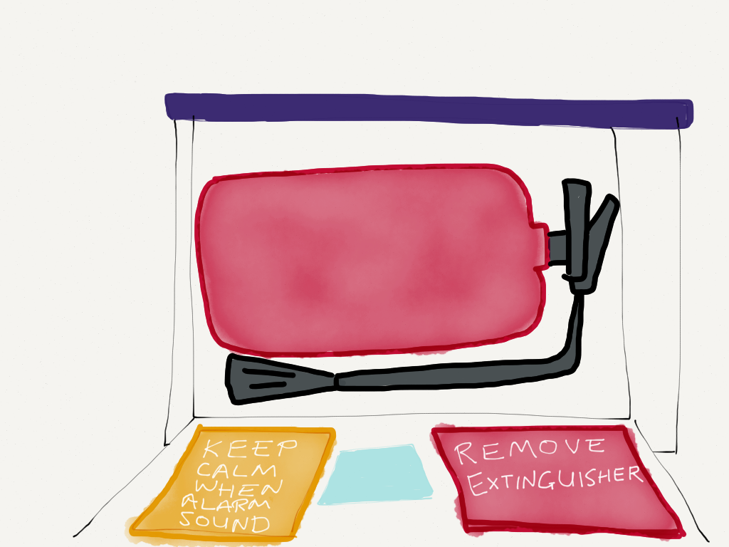
Once opened, there is the next instruction to remove the extinguisher. Notification about the alarm is put in a distinctively different panel to differentiate them. This tells that it is not an instruction - just informing that the alarm will go off.
Well, that's it for my first challenge. Looking forward for a new one next week. Do leave your feedback after reading!
Subscribe to:
Posts (Atom)


